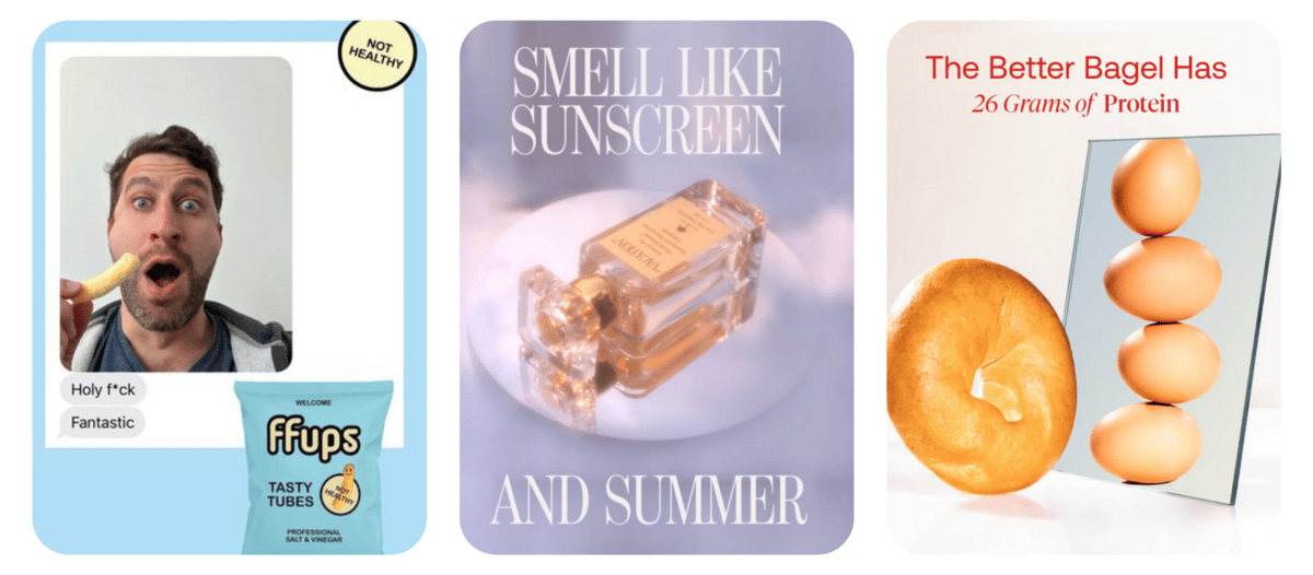
The last time Fraser gave me the reins, we went funky. This time, we’re going back to basics. With the whirlwind of iOS14.5, diminished targeting efforts, AND the inundation of ads just about everywhere, consumers get wiser every day.
Sometimes, the “keep it simple, stupid” method just…works! Here are a few of my favourite simple but incredible ads from this week.
Vacation
Vacation
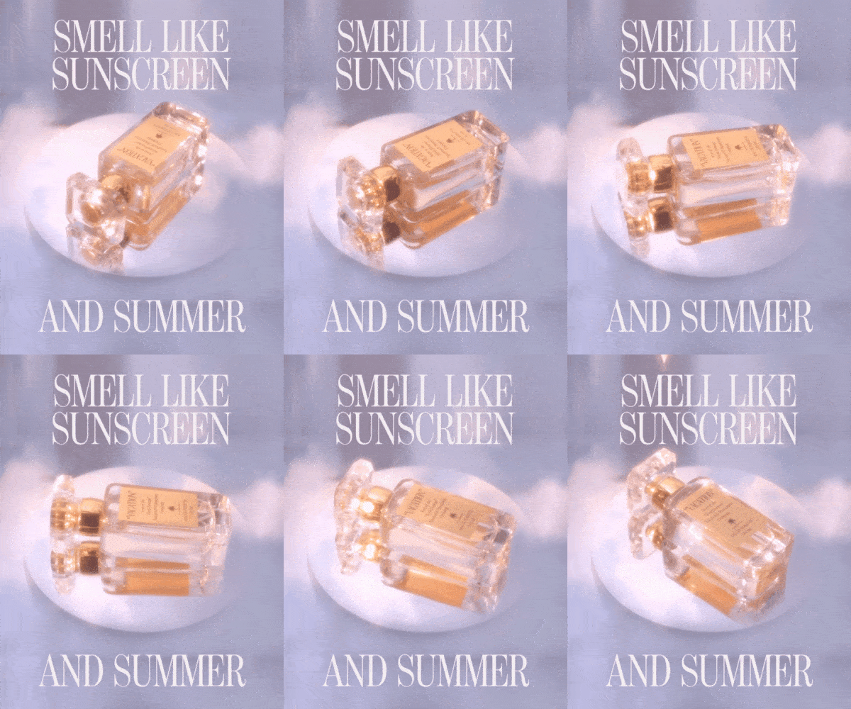
Vacation is a DTC brand that prides itself on having “the world’s best-smelling sunscreen”. The smell alone took the brand straight to virality, so they thought - heck, let’s bottle this thing up into a scent itself! Boom, a delightful fragrance was made.
Vacation truly embodied simplicity in this ad, by making a gorgeous minimalist creative that elegantly displays the product and the value prop in one fell swoop. At first glance, the messaging is clear: want to smell like sunscreen + summer while feeling elegant? We got you. This just screams “we’re targeting people who want to smell like a familiar, casual scent while giving the appeal of a luxury brand”.
The glowy lighting, product rotation, and mirror reflection presents the product as classy, appealing to their more luxury-enticed audience while standing out from the scroll with the unique reflective elements.
Lastly, I love that the font incorporated is reminiscent of high fashion (Vogue, perhaps?), while remaining super-legible and communicating an incredibly simple connection to consumer desire: smell like summer.
How do I know it’s kicking? They’ve been running this ad on Facebook since October 2021. If that’s not longevity on a volatile platform…I don’t know what is.
Ffups
Ffups
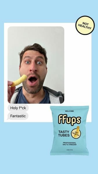
Ffups is a playful DTC brand that intentionally makes “NOT HEALTHY” snacks. They took the delight of a crunchy puffed snack, then boosted it with a bunch of different fun flavours - like cheddar, hot chocolate, cinnamon toast, and more.
This ad rocks not only due to its simplicity but in the way that it truly uses the creative to sort out the highest quality leads possible. Ffups’ target market = consumers who are looking to try something new beyond the grocery store brands, but also don’t want some quinoa stuffed spirulina beetroot health snack. They’ve brought play and joy back into the snack market from every piece of their brand - from the NOT HEALTHY logo on the puffs bag, to the animated, wiggly puffs that pop up on their page when you visit to purchase.
This same lightheartedness and joy was combined with simplicity to create a crusher ad. Think of this as the customer review + UGC, levelled up. We have a direct text message + UGC selfie from the reviewer, with a simple background and product packaging overlaid. Lastly, they added that little “NOT HEALTHY” disclaimer on the ad creative itself to make sure they’re targeting the perfect audience for their product type.
As UGC continues to be the new “go-to” for brands, it can start to feel inauthentic from the customer’s lens. Ffups brought it back with a new twist. LOVE this one!
BETTERBRAND
BETTERBRAND
If you’re active in the DTC space, chances are that you’ve come across Better Brand / Better Bagels before. These wizards have found a way to make delicious bagels that are plant-based, low sugar, low carb, and high protein.
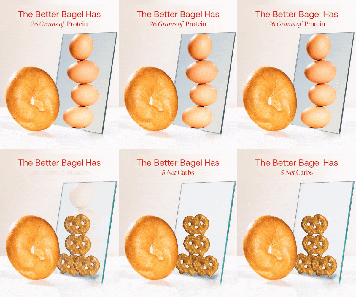
For those in the food & Bev space with a health-oriented product, this is one of my FAVORITE styles of creative. A simple GIF or infographic comparing the nutrition values of your healthier product to something worse-for-you, or comparing directly to real fruits & veggies is always a heavy hitter. Take it from me - I worked in the vitamin industry for years, and this was always one of my major killer creative styles.
I love the simplicity of this ad, combined with the creativity of the bagel “looking at its reflection” while seeing the healthy-food comparisons - 1 gram of sugar (celery), 26 grams of protein (eggs), and arguably the most powerful visualization - 5g net carbs (only 5 small pretzels). Nutrition and health can be a LOT for consumers to digest in a short ad, so visual representations help make those mental connections much smoother.
Pillo (Made by Fraggell)
PILLO
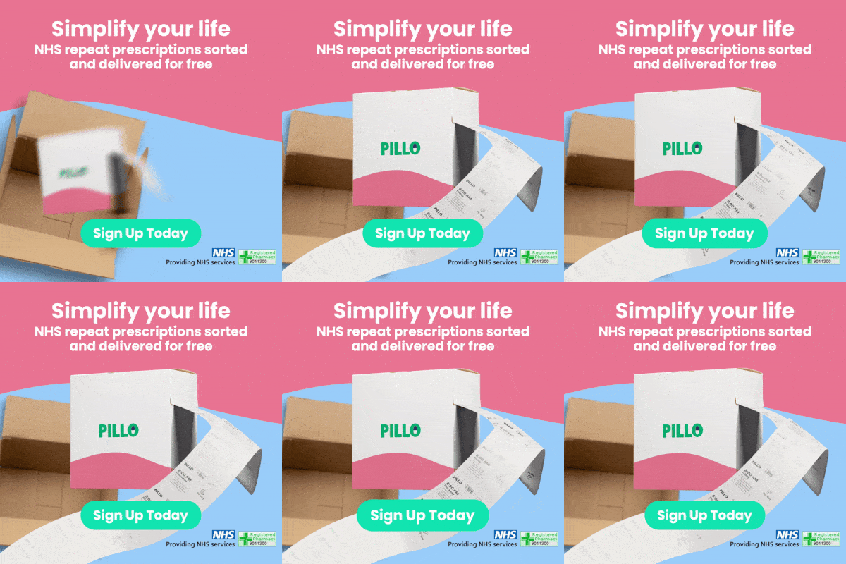
Pillo is a UK-based DTC brand that makes repeat prescriptions super simple. No one loves going to the pharmacy, wrangling all those pill bottles, remembering what to take and when…so Pillo does it for you! They even deliver directly to your door. Seamless.
I’m a little biased because I love Fraser’s creative vision (Fraggell created this ad)…but this ad is awesome while employing the simplicity theme of the week.
First, we have the scroll-stopping element of the Pillo box popping out of the shipping box, along with the animated visualization of the tearable daily pouches. Nothing crazy here - no one taking their meds on top of a skyscraper - but it captures attention and ultimately focuses the viewer on the meat of the ad, the text above.
The header messaging here is perfect (and very aligned with this week’s theme): Simplify your life. Who doesn’t want that?! The subheader then quickly & concisely defines exactly what Pillo does - and stresses that your delivery is free – and we know the people love free shipping.
Finally, a few more callouts. The dynamic CTA jiggles a bit, focusing viewer attention on exactly where to click - and right near that CTA you see the certification badges stressing that Pillo is NHS certified/approved.
There we have it - a beautiful, simple, scroll-stopping creative designed to reach the perfect audience from the jump!
That’s all from me this week…but let me leave you with this - if you haven’t tested a more basic product GIF, or ad creative that’s painfully “to the point” - I challenge you to do so! Simple, concise creative is the best way to ensure that the highest quality leads are the folks actually clicking on your ads. Plus, you’ll never know until you try 😉
Hope you have an AWESOME week!
Cheers