Welcome back to a new issue of Nice Ads. This week, we're going to be learning:
How to make the perfect podcast ad.
The best way to demonstrate your point.
The recipe for a high CTR.
As we quickly head towards Q4, if you need a creative partner to help you achieve a lower CPA and a higher creative hit rate, why not think about speaking with me and my agency by just clicking here.

KURE
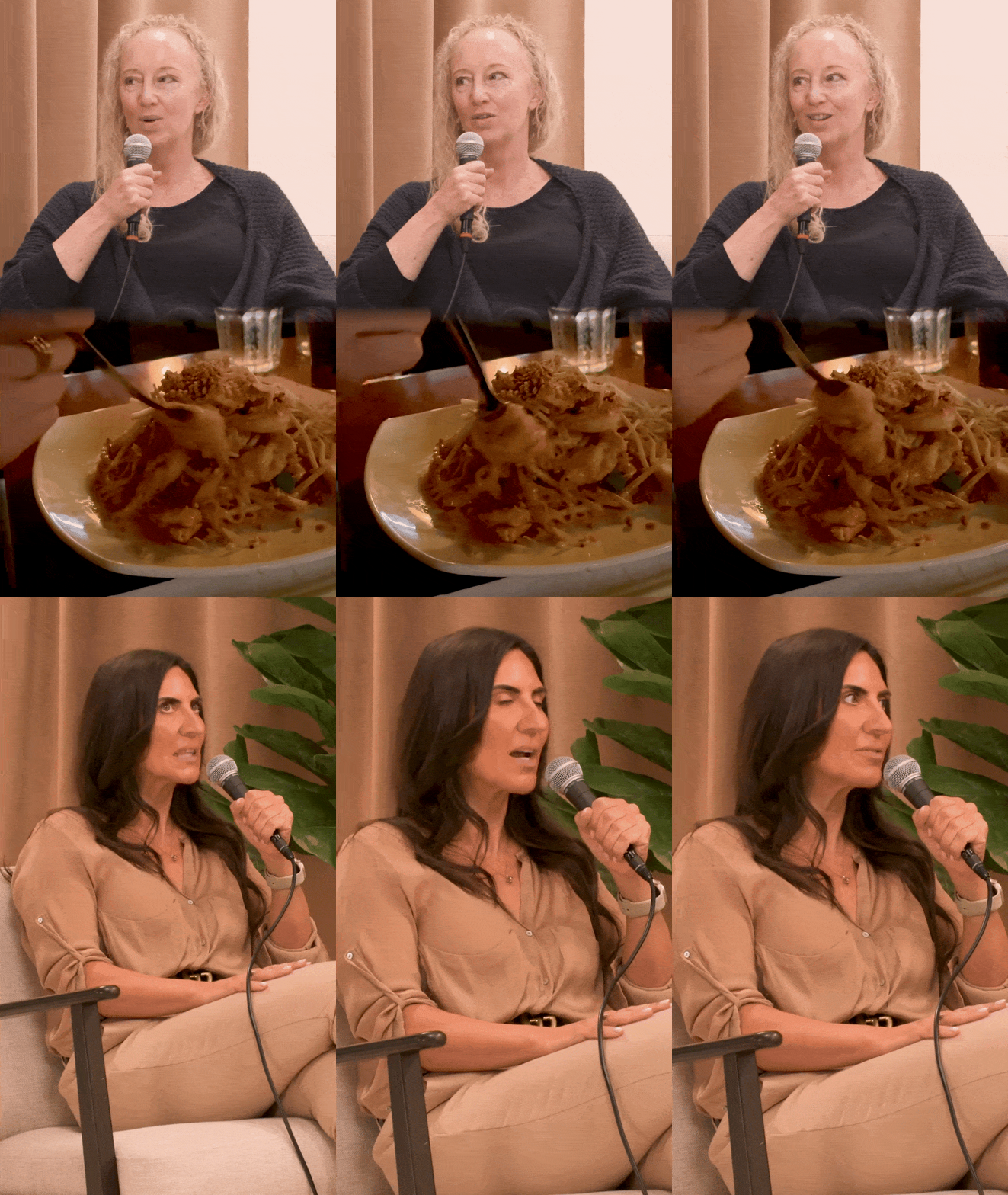
This is a podcast ad that we made for a hypnotherapy app. I wanted to break down why this ad is different to other podcast ads that you might see.
The first draft of the script for this podcast ad featured just two people discussing how the app has helped them. However, we decided to go with something a little different, where an expert suggested this app to the podcast host to help with her cravings. Then, cutting to the next day, having tried it, they explained their results and how they found the experience.
The reason we did this is that it just feels a little more genuine, and it feels like we're coming along on a journey instead of just being talked at.
This is why most podcast ads fail. They come across as very salesy and not very value-driven or realistic. And I think we got around a lot of this by using this format. We also made the edit much slower than other podcast ads because the demographic for this app is much older and so wouldn't appreciate a MrBeast-style edit.
If you're a DTC brand spending over 70,000 a month on ads and would like something like the above, then apply to work with us here.

The Conscious Bar

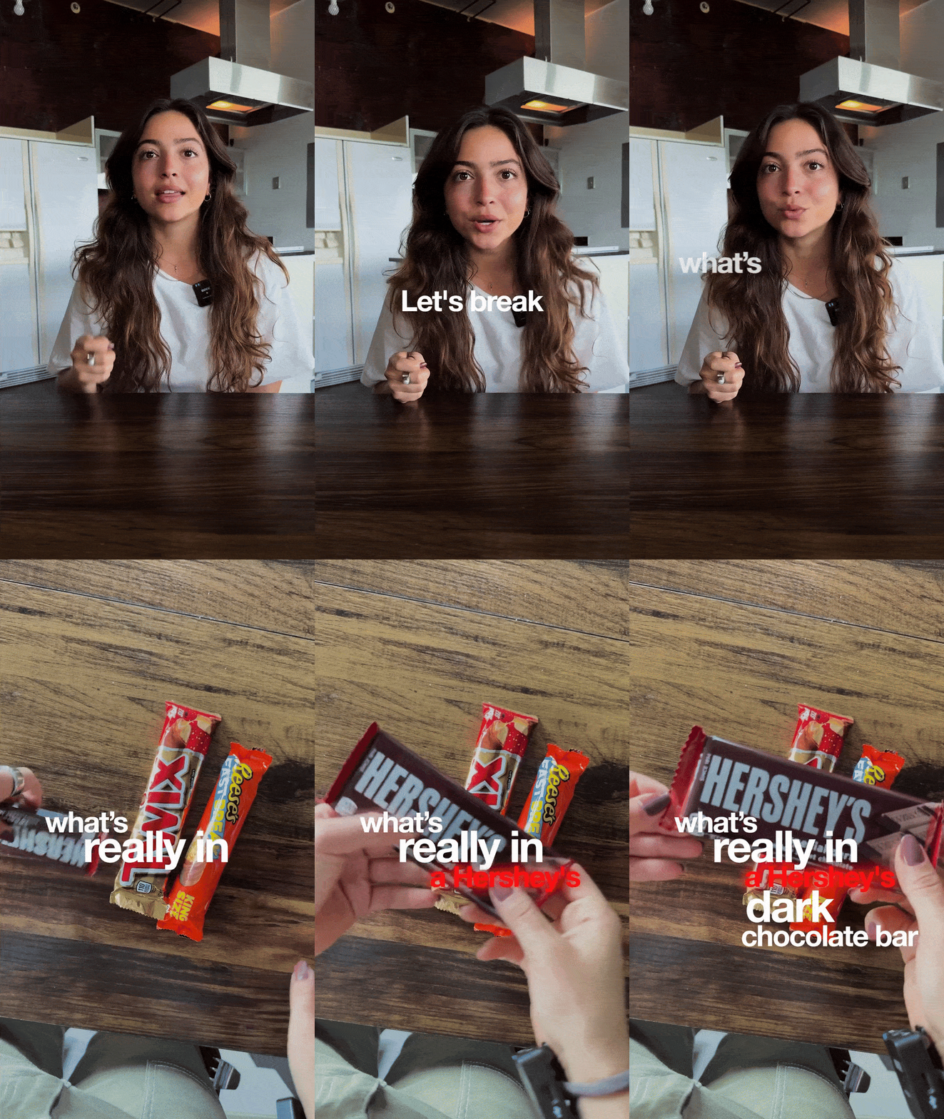
One of my team saved this ad, and when I watched it, I thought it was a fantastic example of the modern-day VSL format ad.
We have a spokesperson filmed in a UGC style, explaining to us why most chocolate bars are bad and why their product is much better. It's a simple product showcase ad in a VSL (video sales letter) style.
However, I think one of the main stand-out aspects of this ad is the way it effectively demonstrates many of the points. Instead of using on-screen graphics that can often distract viewers from the video, they use physical demonstrations, such as circling the ingredients on the bar or visually showing how much sugar is in their competitors' products.
This helps keep the energy up, but also because we see these things happen, it just feels a little more believable and keeps the watch time up.
However, I do think this video could potentially be improved. One of the tests I would conduct if I were to create this ad is to have different creators deliver the same message. This can have a massive impact on performance and also help you discover potential new customer buckets.
TLDR:
Visually show things instead of using on-screen graphics.
Testing different creators is vital when you find a winning script.

Most brands are leaving serious money on the table with their upsells.

Low take rates. Conversion drops. Offers that feel pushy instead of helpful. Ron Shah (CEO of Obvi) and Martins Lasmanis (CEO of Supliful) are hosting a live workshop to fix this. What they'll cover:
Psychology behind why customers say "yes" to upsells
The exact upsell strategy Ron has used to scale past 500K customers
How one brand added $1.7M in 90 days without touching any inventory.
Tools to launch upsells in days, not months
Tuesday, August 12 | 1 PM ET

Looking for more?
Here are 4 ways I can help you 👇
Fraggell - Looking for ads that turn scrollers into customers? My performance ad creative agency has delivered high-convert ads to brands like ALOHA, Chomps, and Nailboo… It’s worth your time to apply today to see if you're a good fit.
Sponsor Nice Ads - Reach over 10,000 marketing decision-makers and fill one of our few ad spots available. Join brands like Motion, Triple Whale, and Minisocial by expressing your interest here.
CreativeOS - Create static ads in seconds with over 800 pre-tested templates for DTC brands. Become a member today and get 50% off your first month.
Foreplay - Improve your creative workflow. Save ads, build briefs, and more. Claim a free trial here.

URO

As I always say, the simple statics are often the ones that get the best results, and this is a perfect example of that. A big fat headline and an image of the product.
The reason this ad worked is that it grabbed attention with the headline and increased curiosity by blurring and censoring the product. This is just going to make people want to find out how they can have better sex. And so they do the only thing that they can do to find out. They click.
If you follow this up with a great landing page that educates the customer on the product and how it helps them achieve their desired outcome, then the customer has a very high chance of converting.
Because static ads sit at the bottom of the funnel, their sole purpose is to push the final few customers over the purchasing edge. To achieve this, the most effective methods are curiosity or social proof. Both of which will get the user to click away from the platform onto your website.
Don't complicate your stats. You can make them at such speed that it isn't worth spending hours on just one of them.
TLDR:
Keep your static ads simple and to the point.
The only job of your ad creative is to get users to click away from the platform.

That's all for this week's Nice Ads. Thanks very much for watching. I recently posted a new YouTube video where I ranked all my favourite ad creative styles. You can watch that here.
I'll see you next week.
✌️
